TL;DR summary 📌
TL;DR summary 📌
Redesigning the landing page unlocked powerful outcomes:
Redesigning the landing page unlocked powerful outcomes:
💬
💬
Client noted higher-quality leads from the site.
Client noted higher-quality leads from the site.
🔼
🔼
40% increase in conversion rate (1.8% → 3.1%)
40%
increase in conversion rate (1.8% → 3.1%)
📨
📨
25% more email sign-ups via lead magnet
25%
more email sign-ups via lead magnet
🔼
🔼
58% drop in bounce rate
58%
drop in bounce rate
Boosting Conversions by 40%
with a Clarity-Driven UX Approach
Boosting Conversions by 40%
with a Clarity-Driven UX Approach
🚀 Landing Page Redesign for a Productivity Coach
🚀 Landing Page Redesign for a Productivity Coach
✨ But first, let’s break down
how we got there
Emily Carterly is a US-based productivity and mindset coach helping professionals build better habits and focus
She runs a 6-week group coaching program with evergreen and launch-based funnels.
Before working with me, Emily used a basic Canva-built page that didn’t reflect her brand’s value, lacked visual clarity, and was too text-heavy for mobile users.
Pain Point: Low conversions, poor engagement on the landing page,
About the Client
About the Client
✨ But first, let’s break down
how we got there
Emily Carterly is a US-based productivity and mindset coach helping professionals build better habits and focus
She runs a 6-week group coaching program with evergreen and launch-based funnels.
Before working with me, Emily used a basic Canva-built page that didn’t reflect her brand’s value, lacked visual clarity, and was too text-heavy for mobile users.
Pain Point: Low conversions, poor engagement on the landing page,
Emily Carterly is a US-based productivity and mindset coach helping professionals build better habits and focus
She runs a 6-week group coaching program with evergreen and launch-based funnels.
Before working with me, Emily used a basic Canva-built page that didn’t reflect her brand’s value, lacked visual clarity, and was too text-heavy for mobile users.
Pain Point: Low conversions, poor engagement on the landing page,
BEFORE REDESIGN
BEFORE REDESIGN
BEFORE REDESIGN

Overall Site Summary


Category
Grade
Comments
Navigation is missing or unclear.
Calls to action (CTAs) lack consistency.
Some sections have low contrast, affecting readability.
Images are not optimized, resulting in slow loading times.
There is no filtering or grouping system for products.
Usability
Visual Design
It looks clean and modern, but the problem is that the images don’t convey any specific associations — it could just as easily be a course on public speaking or modeling.
⚠️ Moderate
Content Clarity
⚠️ Moderate
Some product descriptions need more clarity
The block with subscription is too far awayConversion Optimization
Newsletter lacks incentive; no testimonials
⚠️ Fair
Mobile Responsiveness
Texts and buttons are too small
All content stacks in a single vertical column, creating a very long scroll❌ Poor
⚠️ Fair

Home page

Mobile buttons are very small and hard to tap with a finger.
There is no navigation
No strong hook on the landing screen
Weak Color Contrast
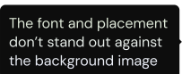

Products section

Too small text descriptions are difficult to read
No clear user journey: there’s no suggestion for “what to do” or “how to navigate”
All content stacks in a single vertical column, creating a very long scroll

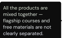


Overall Site Summary
Category
Grade
Comments
Navigation is missing or unclear.
Calls to action (CTAs) lack consistency.
Some sections have low contrast, affecting readability.
Images are not optimized, resulting in slow loading times.
There is no filtering or grouping system for products.
Usability
Visual Design
It looks clean and modern, but the problem is that the images don’t convey any specific associations — it could just as easily be a course on public speaking or modeling.
⚠️ Moderate
Content Clarity
⚠️ Moderate
Some product descriptions need more clarity
The block with subscription is too far awayConversion Optimization
Newsletter lacks incentive; no testimonials
⚠️ Fair
Mobile Responsiveness
Texts and buttons are too small
All content stacks in a single vertical column, creating a very long scroll❌ Poor
⚠️ Fair
Home page
Mobile buttons are very small and hard to tap with a finger.
There is no navigation
No strong hook on the landing screen
Weak Color Contrast
Products section
Too small text descriptions are difficult to read
No clear user journey: there’s no suggestion for “what to do” or “how to navigate”
All content stacks in a single vertical column, creating a very long scroll
Overall Site Summary
Category
Grade
Comments
Navigation is missing or unclear.
Calls to action (CTAs) lack consistency.
Some sections have low contrast, affecting readability.
Images are not optimized, resulting in slow loading times.
There is no filtering or grouping system for products.
Usability
Visual Design
It looks clean and modern, but the problem is that the images don’t convey any specific associations — it could just as easily be a course on public speaking or modeling.
⚠️ Moderate
Content Clarity
⚠️ Moderate
Some product descriptions need more clarity
The block with subscription is too far awayConversion Optimization
Newsletter lacks incentive; no testimonials
⚠️ Fair
Mobile Responsiveness
Texts and buttons are too small
All content stacks in a single vertical column, creating a very long scroll❌ Poor
⚠️ Fair
Home page
Mobile buttons are very small and hard to tap with a finger.
There is no navigation
No strong hook on the landing screen
Weak Color Contrast
Products section
Too small text descriptions are difficult to read
No clear user journey: there’s no suggestion for “what to do” or “how to navigate”
All content stacks in a single vertical column, creating a very long scroll
Overall Site Summary
Category
Grade
Comments
Navigation is missing or unclear.
Calls to action (CTAs) lack consistency.
Some sections have low contrast, affecting readability.
Images are not optimized, resulting in slow loading times.
There is no filtering or grouping system for products.
Usability
Visual Design
It looks clean and modern, but the problem is that the images don’t convey any specific associations — it could just as easily be a course on public speaking or modeling.
⚠️ Moderate
Content Clarity
⚠️ Moderate
Some product descriptions need more clarity
The block with subscription is too far awayConversion Optimization
Newsletter lacks incentive; no testimonials
⚠️ Fair
Mobile Responsiveness
Texts and buttons are too small
All content stacks in a single vertical column, creating a very long scroll❌ Poor
⚠️ Fair
Home page
Mobile buttons are very small and hard to tap with a finger.
There is no navigation
No strong hook on the landing screen
Weak Color Contrast
Products section
Too small text descriptions are difficult to read
No clear user journey: there’s no suggestion for “what to do” or “how to navigate”
All content stacks in a single vertical column, creating a very long scroll
FOCUS WHILE REDESIGN
FOCUS WHILE REDESIGN
Create mobile-first landing page
Create mobile-first landing page
Place the subscription form in a more prominent position and highlight its advantages.
Place the subscription form in a more prominent position and highlight its advantages.
Ensure accessibility is considered, including adequate contrast and appropriately sized buttons.
Ensure accessibility is considered, including adequate contrast and appropriately sized buttons.
Restructure the content for clarity and action
Restructure the content for clarity and action
Create a more personalized website with a focus on Emily’s professionalism and expertise. Add social proof
Create a more personalized website with a focus on Emily’s professionalism and expertise. Add social proof
MY PROCESS
MY PROCESS
MY PROCESS
Audit
Audit
Structure
Structure
Visual Identity
Visual Identity
Design + Development
Design + Development


AFTER REDESIGN
AFTER REDESIGN
AFTER REDESIGN
📊 Quantitative Results:
✅ +40% increase in conversion rate (from 1.8% → 3.1%)
🔽 -58% bounce rate
📩 +25% more email sign-ups from lead magnet
📊 Quantitative Results:
✅ +40% increase in conversion rate (from 1.8% → 3.1%)
🔽 -58% bounce rate
📩 +25% more email sign-ups from lead magnet
📊 Quantitative Results:
✅ +40% increase in conversion rate (from 1.8% → 3.1%)
🔽 -58% bounce rate
📩 +25% more email sign-ups from lead magnet
💬 Qualitative Outcomes:
Client reported a noticeable improvement in
lead quality. More leads came “ready to buy” after reading the page
💬 Qualitative Outcomes:
Client reported a noticeable improvement in lead quality. More leads came “ready to buy” after reading the page
💬 Qualitative Outcomes:
Client reported a noticeable improvement in lead quality. More leads came “ready to buy” after reading the page
RESULTS
RESULTS
RESULTS
“The new page finally speaks to my audience. I’m getting more inquiries from people who actually understand what I do and they’re ready to work with me.”
“The new page finally speaks to my audience. I’m getting more inquiries from people who actually understand what I do and they’re ready to work with me.”
Emily Carterly
Productivity Coach
Emily Carterly
Productivity Coach

📌 Clarity and trust = conversion power in self-help
📌 Simpler structures and stronger messages outperform clutter
📌 Social proof and a good lead magnet are non-negotiable
📌 Clarity and trust = conversion power in self-help
📌 Simpler structures and stronger messages outperform clutter
📌 Social proof and a good lead magnet are non-negotiable
KEY TAKEAWAYS
KEY TAKEAWAYS
KEY TAKEAWAYS
CONTACT
CONTACT
CONTACT
Looking to start a project or you need consultation?
Feel free to contact me.
Looking to start a project or you need consultation?
Feel free to contact me.
FOCUS WHILE REDESIGN
FOCUS WHILE REDESIGN
Create mobile-first landing page
Place the subscription form in a more prominent position and highlight its advantages.
Ensure accessibility is considered, including adequate contrast and appropriately sized buttons.
Restructure the content for clarity and action
Restructure the content for clarity and action
Ensure accessibility is considered
Create a more personalized website with a focus on Emily’s professionalism and expertise. Add social proof
Create a more personalized website with a focus on Emily’s professionalism and expertise. Add social proof